Turning R script into a WebApp
In my last article, I wrote about a data science study using R.
R is undoubtedly a powerful tool for analysis and modelling, but it can fill other needs for the practical data scientist.
You would like to share this beautiful dataviz online ? Your company needs an interactive dashboard displaying KPIs? You want to host a predictive model as an API? All of that is actually doable with R using Shiny.
I will try in this post to guide you through the creation of a Shiny application, using as example a small project I coded a few months ago. It will be the occasion to do some webscrapping and plotting as well.
But first, what is Shiny? Shiny is an R package that makes it easy to build interactive webapps from R. It has been created by RStudio, software editing company also creator of the great eponymous IDE.
Before the WebApp was a simple R script
The example script is scrapping flightaware to collect all flights from Air France airline, and display them on an interactive map. Let’s see how it works step by step.
We start by scrapping the website for Air France flights data. The website only provide 20 info per page, so we need to search for the next page and iterate untill ou page has less than 20 results:
######################## SCRAPPING ########################
library(plyr)
library(dplyr)
library(rvest)
library(stringr)
library(magrittr)

# We load the page giving the flights of Air France
# It displays only 20 results per page, so we need to iterate until the last page
flights_page = read_html("https://fr.flightaware.com/live/fleet/AFR")
last_page = FALSE
loop_count = 0

while( last_page==FALSE ){

  # Get the table with flights info
  live_flights_html = flights_page %>% html_nodes(".prettyTable")
  live_flights_table = html_table(live_flights_html, fill = TRUE, header = TRUE)
  live_flights_df = data.frame(live_flights_table)

  # Check if this is the last page (less than the 20 limit results)
  if(nrow(live_flights_df) < 21) {
    last_page = TRUE
  }
  # For the first iteration, our dataframe does not exist
  if(loop_count == 0) {
    live_flights = live_flights_df
  } else {
    live_flights = rbind(live_flights, live_flights_df)
  }
  next_page_url = flights_page %>% html_nodes(".fullWidth+ span a:nth-child(1)") %>% html_attr("href")
  flights_page = read_html(next_page_url)
  loop_count = loop_count + 1
}

# We use first row as column names and keep only interesting columns
colnames(live_flights) = as.character(unlist(live_flights[1,]))
live_flights = live_flights[-1,1:6]
We obtain a dataframe that looks like this:
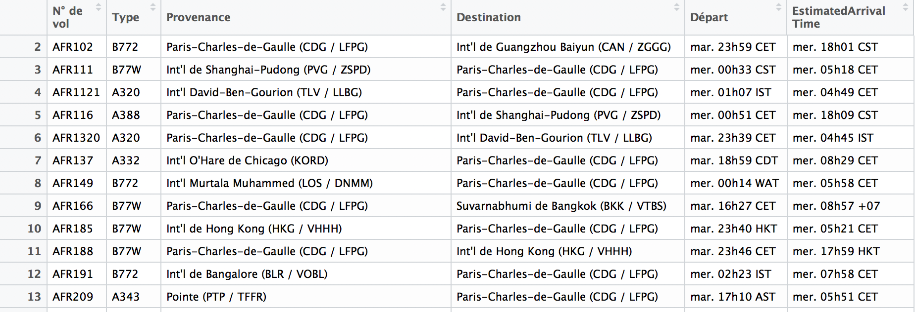
Then, we need to do some feature modification:
- From Provenance and Destination, we need not the name but the geolocation of airports, so we can later place them on a map.
- We add the count of flights in provenance and destination for each airport, so we can change the size of its representation according to affluence.
- We add a feature indicating if a flight is in departing from or arriving to France.
######################## MUNGING ########################
# Get only IACO airports codes from Provenance and Destination features
live_flights = live_flights %>% mutate(Provenance = str_extract(Provenance, "[A-Z]{4}"))
live_flights = live_flights %>% mutate(Destination = str_extract(Destination, "[A-Z]{4}"))
live_flights =  live_flights %>% dplyr::filter(!(is.na(Provenance)))

# Get airport location from external source
# Differenciate french airports for colors on map
airports = read.csv(AIRPORTS_DATA)
french_airports = dplyr::filter(airports, type == "large_airport" | type == "medium_airport" | type == "small_aiport") %>%
  dplyr::filter(iso_country == "FR") %>%
  dplyr::select(ident)
airports = dplyr::filter(airports, type == "large_airport" | type == "medium_airport" | type == "small_aiport") %>%
  dplyr::select(ident, latitude_deg, longitude_deg)
colnames(airports)[2] <- "latitude"
colnames(airports)[3] <- "longitude"

# From IACO official airport code, get the Provenance and Destination coordinates
live_airports = c(live_flights$Provenance, live_flights$Destination) %>% unique()
live_airports = airports %>% dplyr::filter(ident %in% live_airports)
live_airports = live_airports %>% mutate(ident = as.character(ident))
long = live_airports$longitude
lat = live_airports$latitude
names(long) = live_airports$ident
names(lat) = live_airports$ident


# Add the count of flights from/to the airports to size the markers according to frequentation
destination_count = live_flights %>% dplyr::count(Destination) %>% arrange(desc(n))
destination_cnt = destination_count$n
names(destination_cnt) = destination_count$Destination
provenance_count = live_flights %>% dplyr::count(Provenance) %>% arrange(desc(n))
provenance_cnt = provenance_count$n
names(provenance_cnt) = provenance_count$Provenance
i = 1
live_airports$count = rep.int(1, nrow(live_airports))
while(i <= nrow(live_airports)){
  live_airports$count[i] = live_airports$count[i] + ifelse(is.na(provenance_cnt[live_airports$ident[i]]), 0, provenance_cnt[live_airports$ident[i]]) + ifelse(is.na(destination_cnt[live_airports$ident[i]]), 0, destination_cnt[live_airports$ident[i]])
  i = i + 1
}

# Format
live_flights$Provenance_long = live_flights$Provenance
live_flights$Provenance_lat = live_flights$Provenance
live_flights$Destination_long = live_flights$Destination
live_flights$Destination_lat = live_flights$Destination
live_flights = live_flights %>% mutate(Provenance_long = long[Provenance_long])
live_flights = live_flights %>% mutate(Provenance_lat = lat[Provenance_lat])
live_flights = live_flights %>% mutate(Destination_long = long[Destination_long])
live_flights = live_flights %>% mutate(Destination_lat = lat[Destination_lat])
# Add from_france dummy variable
live_flights$from_france = live_flights$Provenance
live_flights = live_flights %>% mutate(from_france = from_france %in% french_airports$ident)
We now have all the information we need to create our vizualisation, time to plot! I use the library Plotly here that provides very good looking maps with ggmap.
######################## PLOTTING ########################
library(plotly)
library(shiny)
library(ggmap)
Sys.setenv('MAPBOX_TOKEN' = MAPBOX_TOKEN)

AIRPORTS_COLOR = "white"
INCOMING_FLIGHTS = "mediumblue"
OUTCOMING_FLIGHTS = "deepskyblue"

plot_mapbox(mode = 'scattermapbox') %>%
  layout(font = list(color='white'),
         plot_bgcolor = '#191A1A', paper_bgcolor = '#191A1A',
         mapbox = list(style = 'dark',
                       center = list(lat = 36.7538,lon = 3.0588),
                       zoom = 3),
         legend = list(orientation = 'h',
                       font = list(size = 14),
                       xanchor = "center",
                       yanchor = "top",
                       x = 0.5,
                       y = 0.1),
         margin = list(l = 25, r = 25,
                       t = 80, b = 80)) %>%
  add_trace(
    name = "Airports",
    hoverinfo = 'text',
    data = live_airports,
    text = ~ident,
    lon = ~longitude,
    lat = ~latitude,
    mode = "markers",
    marker = list(color = AIRPORTS_COLOR),
    opacity = 0.7,
    size = ~count
  ) %>%
  add_segments(
    name = "Flights to France",
    data = live_flights %>% dplyr::filter(from_france == 'FALSE'),
    x = ~Provenance_long, xend = ~Destination_long,
    y = ~Provenance_lat, yend = ~Destination_lat,
    size = I(1),
    hoverinfo = "text",
    text = ~`N° de vol`,
    line = list(color = INCOMING_FLIGHTS),
    opacity = 0.5
  ) %>%
  add_segments(
    name = "Flights from France",
    data = live_flights %>% dplyr::filter(from_france == 'TRUE'),
    x = ~Provenance_long, xend = ~Destination_long,
    y = ~Provenance_lat, yend = ~Destination_lat,
    size = I(1),
    hoverinfo = "text",
    text = ~`N° de vol`,
    line = list(color = OUTCOMING_FLIGHTS),
    opacity = 0.5)
And the output graph should look like this:
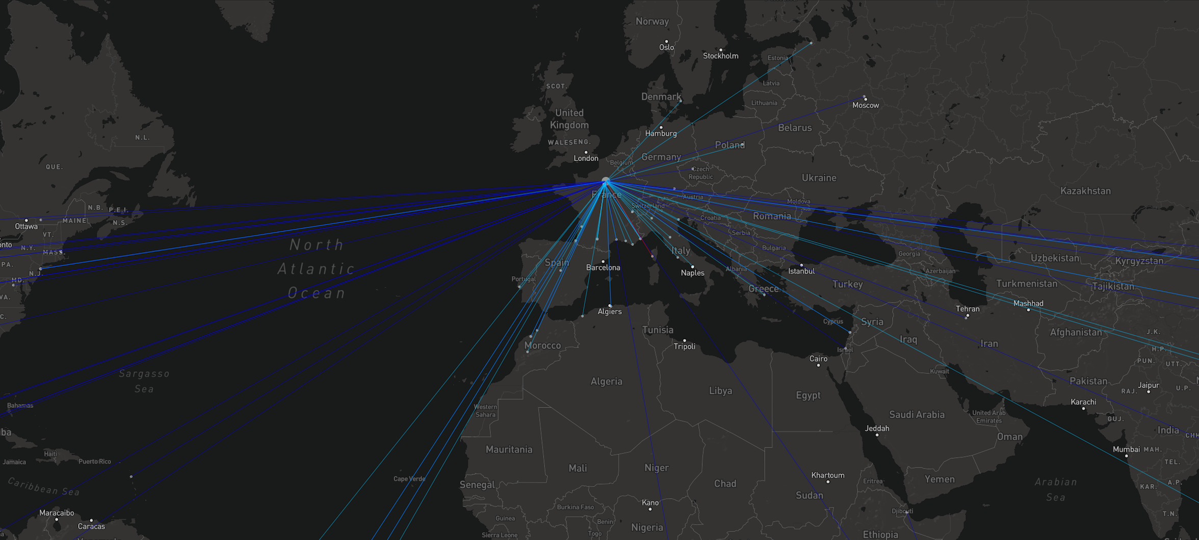
Wonderful! We have our example. It looks a bit long as a first read but it is relatively easy. Don’t hesitate to copy the code or try to create the data visualisation you want for the following part.
Turn our R script to a Shiny App
Now that we are happy with our R script, it only takes a few manipulations to turn it into a Shiny app.
We just want to modify our initial code to fit the required structure of Shiny. Taken directly from the official website:
Shiny apps are contained in a single script called app.R. The script app.R lives in a directory (for example, newdir/) and the app can be run with runApp(“newdir”).
app.R has three components:
- a user interface object
- a server function
- a call to the shinyApp function
The user interface (ui) object controls the layout and appearance of your app.
The server function contains the instructions that your computer needs to build your app.
Finally the shinyApp function creates Shiny app objects from an explicit UI/server pair.
Basically, we just have to create a ui part with a bit of Html, and put our entire operations in the server function. Which would give us something like this:
library(shiny)
######################## UI ########################
ui = fillPage(
  tags$style(HTML(".control-label {color: white};")),
  tags$style(HTML("body {background-color: #191a1a};")),
  title = "R France app",
  titlePanel(
    h1("✈️ R France app ✈️ ", align="center", style="color: white")
    ),
  h3("Displays all the current flights of Air France airline, all around the world", align = "center", style = "color: white"),
  plotlyOutput("plot", width = "100%", height = "85%"),
  h5("Airports size is weighted according to AF traffic. Just fly over flights and airports to see informations", align = "center", style = "color: white"),
  h5("Flights data is from flightaware.com", align = "center", style = "color: white")
)

######################## SERVER  ########################
server = function(input, output) {
    library(plyr)
    library(dplyr)
    library(rvest)
    library(stringr)
    library(magrittr)

    # We load the page giving the flights of Air France
    # It displays only 20 results per page, so we need to iterate until the last page
    flights_page = read_html("https://fr.flightaware.com/live/fleet/AFR")
    last_page = FALSE
    loop_count = 0

    ...
    ...

    output$plot <- renderPlotly({
      plot_mapbox(mode = 'scattermapbox') %>% ...Etc.
      })
  }

######################## CALL ########################
  shinyApp(ui, server)
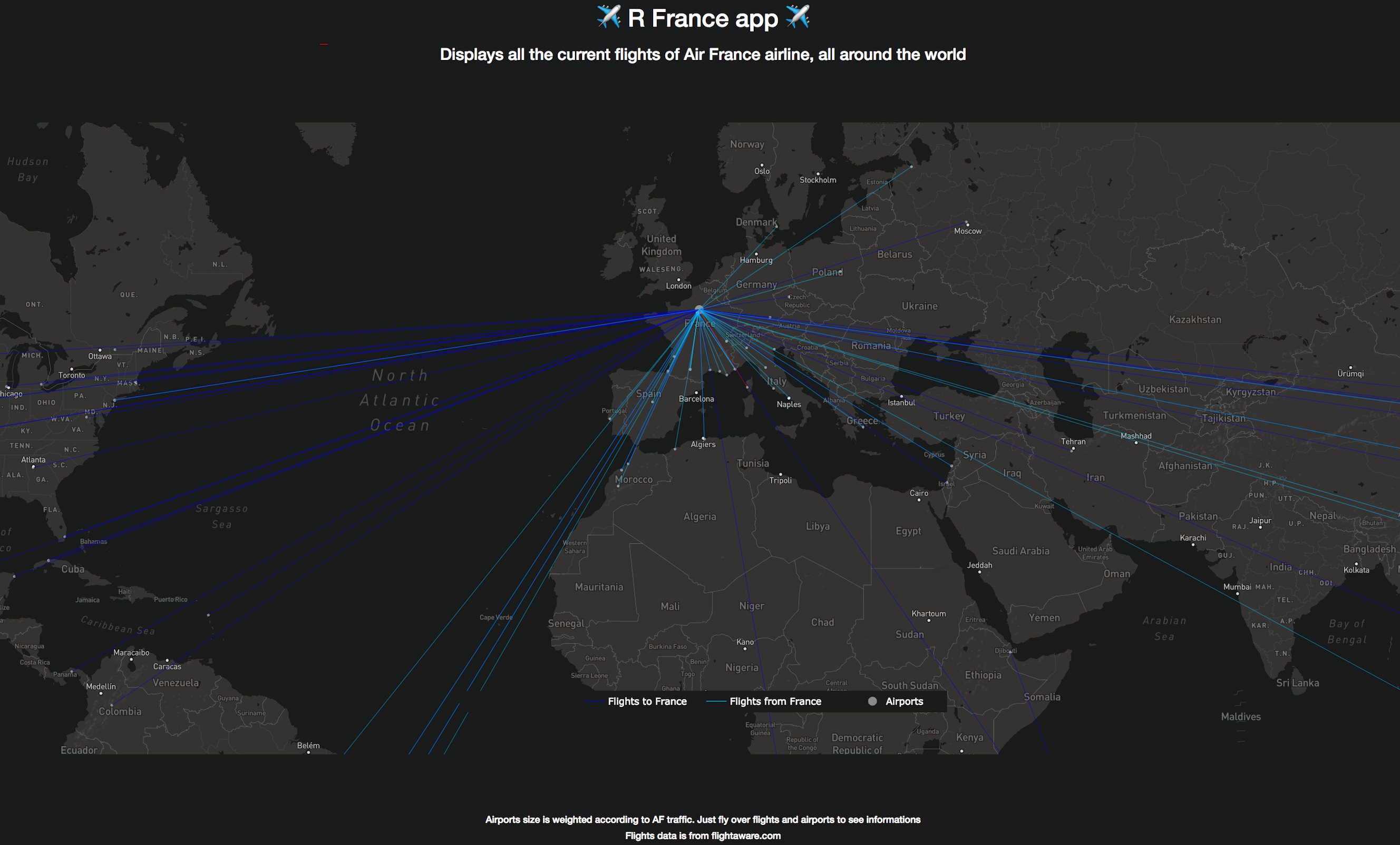
And we are done ! The only point of attention is that certain elements in Shiny can be reactive, that is update in real time if the data/calculation changes in the script. In that case, the reactive objects must be build as output objects in server, and added to the User interface.
The only reactive element here is our graph, which is declared plotlyOutput("plot", width = "100%", height = "85%") in our UI, and should be changed to output$plot <- renderPlotly in the server function.
This is what our final app looks like, with the same flights input:
Turn our Shiny App to a WebApp
Of course, the Shiny app can be run in local, either using runApp()or directly from RStudio. But what if we want to put it online ?
There is several possibilities to host a Shiny app:
- The first and easiest one is to use Shinyapps.io, a service provided by Shiny’s creators and requires no setup. You can host one app publicly for free, which is nice to experiment.
- Another option is to dockerize your Shiny app, and deploy it on a service you already have access to, such as AWS cloud.
- Finally, there is Shiny Server that is an open source solution provided again by Rstudio. I did not try that one and would be happy to get your feedbacks!
I hope you get to discover a bit more about R various functionalities, and invite you to take a look at the Shiny Gallery for more ideas and impressive designs.